
Basic Filters
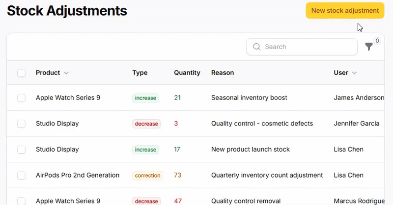
Filament's filter system transforms overwhelming data tables into focused, actionable interfaces by providing intuitive controls that let users quickly narrow down information to exactly what they need. Rather than forcing users to scroll through hundreds of records, these filters create a smooth, responsive experience where finding specific data becomes effortless. From simple checkboxes to sophisticated dropdown menus, each filter type is designed to handle different data patterns while maintaining the same clean, professional interface that makes Filament applications feel polished and user-friendly.
# Checkbox filters for boolean values
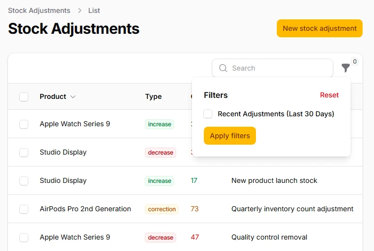
The most straightforward filtering approach uses simple checkboxes to toggle specific conditions on or off. Perfect for binary states like "featured items," "published content," or "active users." When checked, the filter applies its query scope; when unchecked, it removes the condition entirely, giving users immediate visual feedback about which filters are active.
->filters([
    Filter::make('recent_adjustments')
        ->label('Recent Adjustments (Last 30 Days)')
        ->query(function () {
            // ...
        }),
])
# Toggle switch filters for modern interfaces
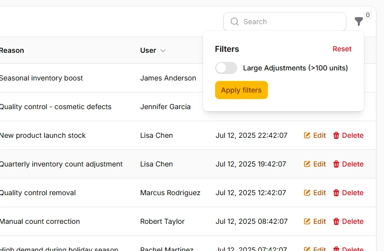
Replace traditional checkboxes with sleek toggle switches that provide the same functionality with a more contemporary feel. Toggle switches are particularly effective for mobile interfaces and give your filters a polished, app-like appearance that users expect from modern web applications.
->filters([
    Filter::make('large_adjustments')
        ->label('Large Adjustments (>100 units)')
        ->toggle()
        ->query(function() {
            // ...
        }),
])
# Select dropdown filters for predefined options
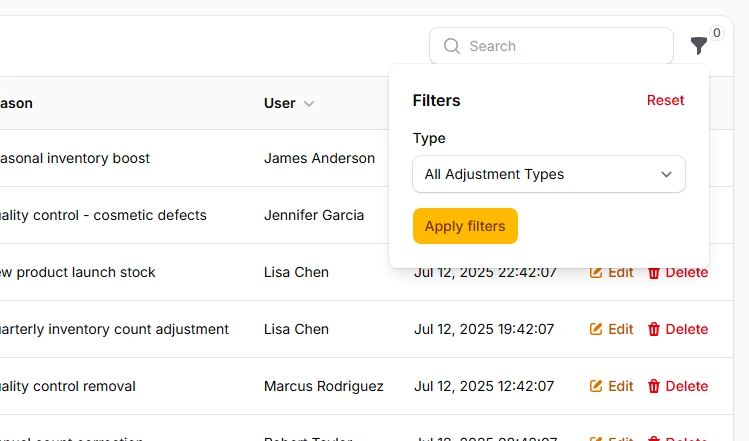
When users need to choose from specific categories or statuses, select filters provide an elegant dropdown interface. These filters automatically handle the query logic based on the selected value, eliminating the need for custom query callbacks while supporting both single and multiple selections for complex filtering scenarios.
->filters([
    SelectFilter::make('type')
        ->options([
            'increase' => 'Stock Increase',
            'decrease' => 'Stock Decrease',
            'correction' => 'Stock Correction',
        ])
        ->placeholder('All Adjustment Types'),
])
# Multi-select filters for flexible combinations
Enable users to select multiple values simultaneously by allowing them to combine different filter criteria. This is particularly powerful for status filtering where users might want to see both "draft" and "reviewing" content, or for category filtering where multiple departments need to be included in the results.
->filters([
    SelectFilter::make('type')
        ->multiple()
        ->options([
            'increase' => 'Stock Increase',
            'decrease' => 'Stock Decrease',
            'correction' => 'Stock Correction',
        ])
        ->placeholder('Select Adjustment Types'),
])
# Ternary filters for nullable columns
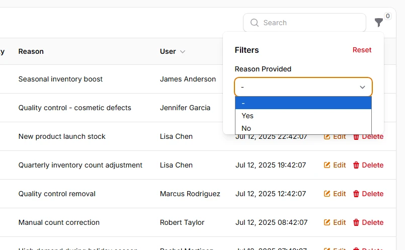
Handle three-state filtering scenarios where you need to distinguish between true, false, and null values. Commonly used for verification status, approval workflows, or any nullable boolean column where the absence of a value has meaning. The ternary filter provides clear labels for each state and intelligent query handling.
->filters([
    TernaryFilter::make('reason')
        ->label('Reason Provided')
        ->nullable()
        // You may choose labels for TernaryFilter
        ->placeholder('All Adjustments')
        ->trueLabel('With Reason')
        ->falseLabel('Without Reason'),
])
# Text search filters for content discovery
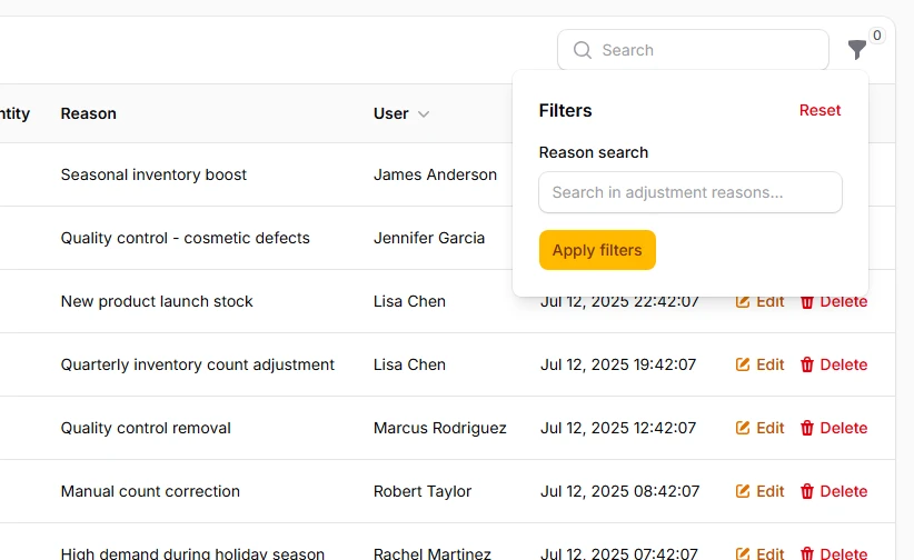
Create flexible text-based filtering using custom form components that allow users to search within specific fields or across multiple columns. These filters provide immediate feedback and can be combined with other filter types for comprehensive data discovery capabilities.
->filters([
    Filter::make('search_reason')
        ->schema([
            TextInput::make('reason_search')
                ->placeholder('Search in adjustment reasons...')
                ->live()
        ])
        ->query(function () {
            // ...
        }),
]);