
Responsive Tables
Instead of forcing horizontal scrolling or cramming too much information into tiny columns, Filament provides powerful layout components that intelligently transform table layouts across different screen sizes. From simple column hiding to sophisticated card-like mobile layouts, these tools let you create truly responsive data presentations that work beautifully on any device.
# Simple column visibility control
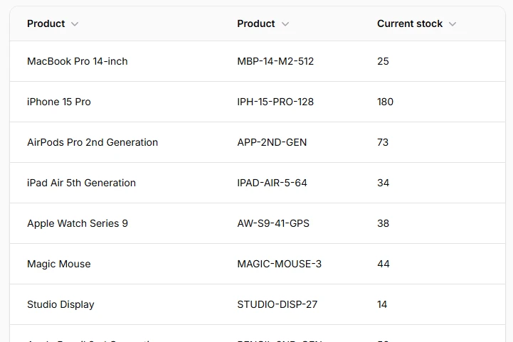
Hide or show columns based on screen size using responsive breakpoints. Perfect for reducing clutter on mobile while maintaining full information on desktop. Uses Tailwind's standard breakpoints (sm, md, lg, xl, 2xl) for predictable behavior.
TextColumn::make('sku')
    ->visibleFrom('md'), // Show only on medium screens and larger

TextColumn::make('description')
    ->hiddenFrom('lg'), // Hide on large screens and larger
# Split layout for mobile stacking
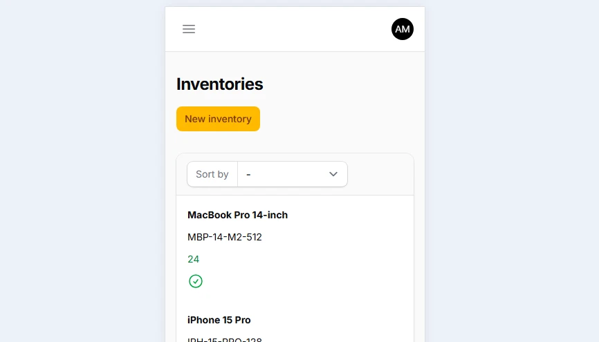
Transforms horizontal column layouts into vertical stacks on mobile while maintaining side-by-side presentation on larger screens. The Split component uses flexbox internally and automatically stacks content below the md breakpoint by default.
Split::make([
    TextColumn::make('product.name')
        ->sortable(),

    TextColumn::make('product.sku')
        ->sortable(),

    TextColumn::make('available_stock')
        ->numeric()
        ->sortable(),

    IconColumn::make('needs_reorder')
        ->boolean(),
])->from('md')
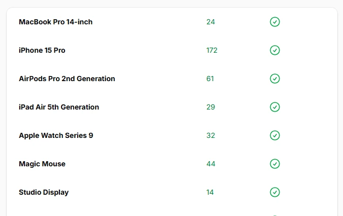
# Stack layout for vertical grouping
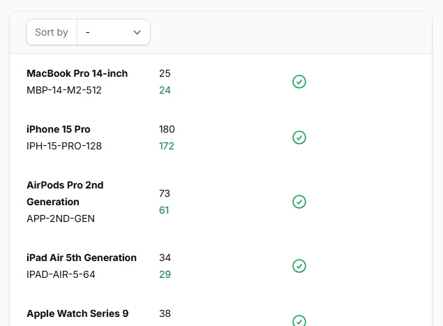
Group related columns vertically within table cells, creating card-like layouts perfect for mobile viewing. Stack components ensure related information stays visually connected while maintaining readability on smaller screens.
Split::make([
    Stack::make([
        TextColumn::make('product.name')
            ->weight('bold'),

        TextColumn::make('product.sku')
            ->color('gray'),
    ]),

    Stack::make([
        TextColumn::make('current_stock')
            ->label('Current'),

        TextColumn::make('available_stock')
            ->label('Available'),
    ]),

    IconColumn::make('needs_reorder')
        ->boolean(),
])
# Grid layout for consistent widths
Use CSS Grid instead of flexbox for more consistent column widths, especially when content varies significantly between rows. Grid layouts maintain uniform spacing and alignment across all table rows.
Grid::make([
    'sm' => 5,
])
->schema([
    TextColumn::make('product.name')
        ->columnSpan(3),

    TextColumn::make('available_stock')
        ->numeric(),

    IconColumn::make('needs_reorder')
        ->boolean(),
])
# Panel layout for collapsible content
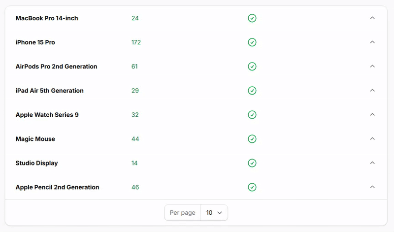
Create expandable sections within table rows using Panel components. Perfect for displaying detailed information that can be revealed on demand, keeping the main table clean while providing access to comprehensive data.
return $table
    ->columns([
        Split::make([
            TextColumn::make('product.name'),

            TextColumn::make('available_stock'),

            IconColumn::make('needs_reorder')
                ->boolean(),
        ]),

        Panel::make([
            Stack::make([
                TextColumn::make('product.sku')
                    ->label('SKU'),

                TextColumn::make('last_restocked_at')
                    ->dateTime(),
            ]),
        ])
        ->collapsible(),
        ->collapsed(true) // optionally you can set default collapsed state
    ]);