
Chart Widgets
Transform raw data into compelling visual stories with Filament's powerful chart widget system. Built on the proven Chart.js foundation, these widgets provide everything from simple line graphs to complex multi-dataset visualizations, all with real-time polling capabilities and extensive customization options. Whether you're tracking user engagement, monitoring sales performance, or visualizing complex business metrics, Filament's chart widgets deliver interactive, responsive charts that automatically refresh and adapt to your data.
# Basic chart creation
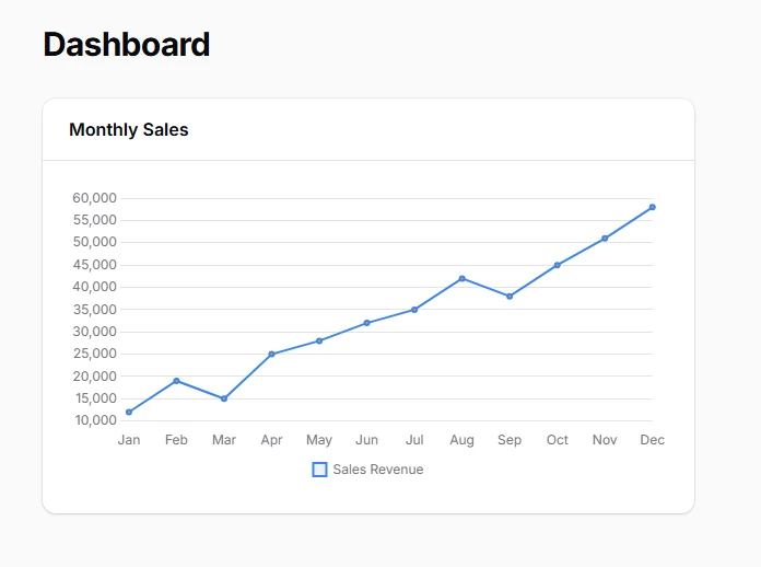
Create interactive charts using the unified ChartWidget class with flexible chart type selection. All chart types share the same foundational structure while offering unique visualization capabilities through the getType() method. This approach ensures consistent API patterns across different chart implementations while maintaining the full power of Chart.js customization.
<?php

namespace App\Filament\Widgets;

use Filament\Widgets\ChartWidget;

class SalesChart extends ChartWidget
{
    protected ?string $heading = 'Monthly Sales';

    protected function getData(): array
    {
        return [
            'datasets' => [
                [
                    'label' => 'Sales Revenue',
                    'data' => [12000, 19000, 15000, 25000, 28000, 32000, 35000, 42000, 38000, 45000, 51000, 58000],
                    'backgroundColor' => 'rgba(59, 130, 246, 0.1)',
                    'borderColor' => 'rgb(59, 130, 246)',
                ],
            ],
            'labels' => ['Jan', 'Feb', 'Mar', 'Apr', 'May', 'Jun', 'Jul', 'Aug', 'Sep', 'Oct', 'Nov', 'Dec'],
        ];
    }

    protected function getType(): string
    {
        return 'line'; // Switch to 'bar', 'pie', 'doughnut', 'bubble', 'polarArea', 'radar', or 'scatter'
    }
}
# Multi-dataset chart visualization
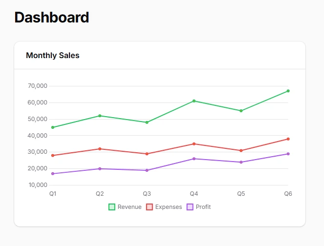
Display complex relationships between multiple data series using Chart.js's robust dataset structure. Each dataset can have independent styling, colors, and data types, enabling rich comparative visualizations that help users understand correlations and trends across different metrics simultaneously.
protected function getData(): array
{
    return [
        'datasets' => [
            [
                'label' => 'Revenue',
                'data' => [45000, 52000, 48000, 61000, 55000, 67000],
                'backgroundColor' => 'rgba(34, 197, 94, 0.2)',
                'borderColor' => 'rgb(34, 197, 94)',
                'borderWidth' => 2,
            ],
            [
                'label' => 'Expenses',
                'data' => [28000, 32000, 29000, 35000, 31000, 38000],
                'backgroundColor' => 'rgba(239, 68, 68, 0.2)',
                'borderColor' => 'rgb(239, 68, 68)',
                'borderWidth' => 2,
            ],
            [
                'label' => 'Profit',
                'data' => [17000, 20000, 19000, 26000, 24000, 29000],
                'backgroundColor' => 'rgba(168, 85, 247, 0.2)',
                'borderColor' => 'rgb(168, 85, 247)',
                'borderWidth' => 2,
            ],
        ],
        'labels' => ['Q1', 'Q2', 'Q3', 'Q4', 'Q5', 'Q6'],
    ];
}
# Bar chart for categorical comparisons
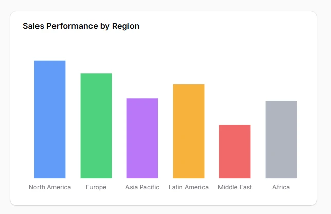
Display categorical data comparisons with clear visual hierarchy using bar charts that excel at showing differences between discrete categories. Bar charts provide excellent readability for performance metrics, regional sales data, and competitive analysis where precise value comparison is essential.
class RegionalSalesChart extends ChartWidget
{
    protected ?string $heading = 'Sales Performance by Region';
    protected string $color = 'primary';

    protected function getData(): array
    {
        return [
            'datasets' => [
                [
                    'label' => 'Q4 2024 Sales',
                    'data' => [425000, 380000, 290000, 340000, 195000, 280000],
                    'backgroundColor' => [
                        'rgba(59, 130, 246, 0.8)',   // North America
                        'rgba(34, 197, 94, 0.8)',    // Europe
                        'rgba(168, 85, 247, 0.8)',   // Asia Pacific
                        'rgba(245, 158, 11, 0.8)',   // Latin America
                        'rgba(239, 68, 68, 0.8)',    // Middle East
                        'rgba(156, 163, 175, 0.8)',  // Africa
                    ],
                    'borderColor' => '#ffffff',
                    'borderWidth' => 2,
                ],
            ],
            'labels' => ['North America', 'Europe', 'Asia Pacific', 'Latin America', 'Middle East', 'Africa'],
        ];
    }

    protected function getType(): string
    {
        return 'bar';
    }

    protected function getOptions(): array
    {
        return [
            'scales' => [
                'y' => [
                    'beginAtZero' => true,
                    'ticks' => [
                        'callback' => 'function(value) { return "$" + (value/1000) + "K"; }',
                    ],
                ],
            ],
            'plugins' => [
                'legend' => [
                    'display' => false,
                ],
            ],
        ];
    }
}
# Pie chart for market share visualization

Represent proportional relationships and market distribution with pie charts that clearly show how individual segments contribute to the whole. Perfect for budget allocations, market share analysis, and demographic breakdowns where understanding relative proportions is key to strategic decisions.
class MarketShareChart extends ChartWidget
{
    protected ?string $heading = 'Market Share Distribution';

    protected function getData(): array
    {
        return [
            'datasets' => [
                [
                    'label' => 'Market Share %',
                    'data' => [28.5, 22.1, 18.3, 15.7, 8.9, 6.5],
                    'backgroundColor' => [
                        'rgb(59, 130, 246)',   // Company A
                        'rgb(34, 197, 94)',    // Company B
                        'rgb(168, 85, 247)',   // Company C
                        'rgb(245, 158, 11)',   // Company D
                        'rgb(239, 68, 68)',    // Company E
                        'rgb(156, 163, 175)',  // Others
                    ],
                    'borderColor' => '#ffffff',
                    'borderWidth' => 3,
                    'hoverOffset' => 10,
                ],
            ],
            'labels' => ['TechCorp', 'InnovateX', 'DataFlow', 'CloudFirst', 'StartupY', 'Others'],
        ];
    }

    protected function getType(): string
    {
        return 'pie';
    }

    protected function getOptions(): array
    {
        return [
            'plugins' => [
                'legend' => [
                    'position' => 'right',
                    'labels' => [
                        'padding' => 20,
                        'usePointStyle' => true,
                    ],
                ],
                'tooltip' => [
                    'callbacks' => [
                        'label' => 'function(context) { return context.label + ": " + context.parsed + "%"; }',
                    ],
                ],
            ],
            'maintainAspectRatio' => false,
        ];
    }

    public function getDescription(): ?string
    {
        return 'Current market position showing **competitive landscape** and opportunities for growth in underserved segments.';
    }
}
# Doughnut chart for engagement metrics
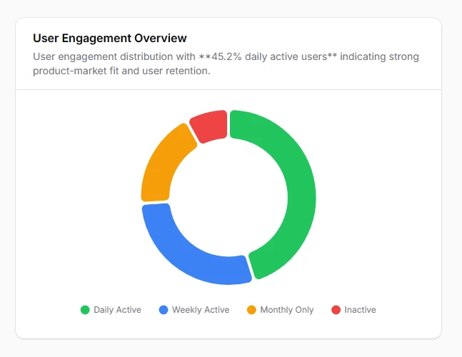
Combine central focus metrics with proportional breakdowns using doughnut charts that provide space for key performance indicators while showing detailed segment analysis. Ideal for user engagement, conversion funnels, and goal tracking with prominent central statistics.
class UserEngagementChart extends ChartWidget
{
    protected ?string $heading = 'User Engagement Overview';

    protected function getData(): array
    {
        return [
            'datasets' => [
                [
                    'label' => 'User Activity',
                    'data' => [45.2, 28.7, 18.1, 8.0],
                    'backgroundColor' => [
                        'rgb(34, 197, 94)',    // Active Users
                        'rgb(59, 130, 246)',   // Occasional Users
                        'rgb(245, 158, 11)',   // Inactive Users
                        'rgb(239, 68, 68)',    // Churned Users
                    ],
                    'borderColor' => '#ffffff',
                    'borderWidth' => 4,
                    'cutout' => '65%',
                    'hoverOffset' => 8,
                ],
            ],
            'labels' => ['Daily Active', 'Weekly Active', 'Monthly Only', 'Inactive'],
        ];
    }

    protected function getType(): string
    {
        return 'doughnut';
    }

    protected function getOptions(): array
    {
        return [
            'plugins' => [
                'legend' => [
                    'position' => 'bottom',
                    'labels' => [
                        'padding' => 25,
                        'usePointStyle' => true,
                    ],
                ],
                'tooltip' => [
                    'callbacks' => [
                        'label' => 'function(context) { return context.label + ": " + context.parsed + "% of users"; }',
                    ],
                ],
            ],
            'elements' => [
                'arc' => [
                    'borderRadius' => 8,
                ],
            ],
            'maintainAspectRatio' => false,
        ];
    }

    public function getDescription(): ?string
    {
        return 'User engagement distribution with **45.2% daily active users** indicating strong product-market fit and user retention.';
    }
}
# Polar area chart for performance metrics
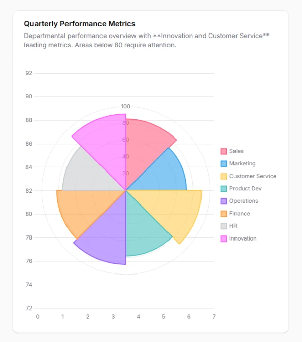
Display cyclical or radial data patterns with polar area charts that emphasize magnitude differences while maintaining categorical relationships. Excellent for seasonal analysis, performance ratings, and time-based comparisons where both angle and radius convey meaningful information.
class PerformanceRadarChart extends ChartWidget
{
    protected ?string $heading = 'Quarterly Performance Metrics';

    protected function getData(): array
    {
        return [
            'datasets' => [
                [
                    'label' => 'Performance Score',
                    'data' => [85, 72, 90, 78, 88, 82, 75, 91],
                    'backgroundColor' => [
                        'rgba(255, 99, 132, 0.6)',
                        'rgba(54, 162, 235, 0.6)',
                        'rgba(255, 205, 86, 0.6)',
                        'rgba(75, 192, 192, 0.6)',
                        'rgba(153, 102, 255, 0.6)',
                        'rgba(255, 159, 64, 0.6)',
                        'rgba(201, 203, 207, 0.6)',
                        'rgba(255, 99, 255, 0.6)',
                    ],
                    'borderColor' => [
                        'rgb(255, 99, 132)',
                        'rgb(54, 162, 235)',
                        'rgb(255, 205, 86)',
                        'rgb(75, 192, 192)',
                        'rgb(153, 102, 255)',
                        'rgb(255, 159, 64)',
                        'rgb(201, 203, 207)',
                        'rgb(255, 99, 255)',
                    ],
                    'borderWidth' => 2,
                ],
            ],
            'labels' => [
                'Sales',
                'Marketing',
                'Customer Service',
                'Product Dev',
                'Operations',
                'Finance',
                'HR',
                'Innovation'
            ],
        ];
    }

    protected function getType(): string
    {
        return 'polarArea';
    }

    protected function getOptions(): array
    {
        return [
            'scales' => [
                'r' => [
                    'beginAtZero' => true,
                    'max' => 100,
                    'ticks' => [
                        'stepSize' => 20,
                    ],
                    'grid' => [
                        'color' => 'rgba(0, 0, 0, 0.1)',
                    ],
                ],
            ],
            'plugins' => [
                'legend' => [
                    'position' => 'right',
                    'labels' => [
                        'padding' => 15,
                    ],
                ],
                'tooltip' => [
                    'callbacks' => [
                        'label' => 'function(context) { return context.label + ": " + context.parsed.r + "/100"; }',
                    ],
                ],
            ],
        ];
    }

    public function getDescription(): ?string
    {
        return 'Departmental performance overview with **Innovation and Customer Service** leading metrics. Areas below 80 require attention.';
    }
}
# Radar chart for multi-criteria evaluation
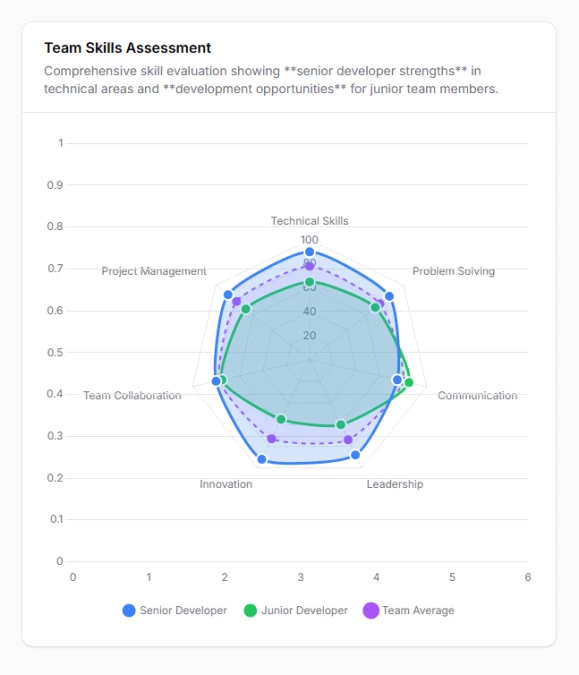
Create comprehensive skill assessments and multi-dimensional comparisons using radar charts that display multiple metrics simultaneously in a web-like pattern. Perfect for employee evaluations, product comparisons, and competitive analysis requiring holistic performance views.
class SkillAssessmentChart extends ChartWidget
{
    protected ?string $heading = 'Team Skills Assessment';

    protected function getData(): array
    {
        return [
            'datasets' => [
                [
                    'label' => 'Senior Developer',
                    'data' => [90, 85, 75, 88, 92, 80, 87],
                    'borderColor' => 'rgb(59, 130, 246)',
                    'backgroundColor' => 'rgba(59, 130, 246, 0.2)',
                    'borderWidth' => 3,
                    'pointBackgroundColor' => 'rgb(59, 130, 246)',
                    'pointBorderColor' => '#ffffff',
                    'pointBorderWidth' => 2,
                    'pointRadius' => 6,
                ],
                [
                    'label' => 'Junior Developer',
                    'data' => [65, 70, 85, 60, 55, 75, 68],
                    'borderColor' => 'rgb(34, 197, 94)',
                    'backgroundColor' => 'rgba(34, 197, 94, 0.2)',
                    'borderWidth' => 3,
                    'pointBackgroundColor' => 'rgb(34, 197, 94)',
                    'pointBorderColor' => '#ffffff',
                    'pointBorderWidth' => 2,
                    'pointRadius' => 6,
                ],
                [
                    'label' => 'Team Average',
                    'data' => [78, 75, 80, 74, 73, 77, 78],
                    'borderColor' => 'rgb(168, 85, 247)',
                    'backgroundColor' => 'rgba(168, 85, 247, 0.1)',
                    'borderWidth' => 2,
                    'pointBackgroundColor' => 'rgb(168, 85, 247)',
                    'borderDash' => [5, 5],
                    'pointRadius' => 4,
                ],
            ],
            'labels' => [
                'Technical Skills',
                'Problem Solving',
                'Communication',
                'Leadership',
                'Innovation',
                'Team Collaboration',
                'Project Management'
            ],
        ];
    }

    protected function getType(): string
    {
        return 'radar';
    }

    protected function getOptions(): array
    {
        return [
            'scales' => [
                'r' => [
                    'beginAtZero' => true,
                    'max' => 100,
                    'ticks' => [
                        'stepSize' => 20,
                        'color' => '#6b7280',
                    ],
                    'grid' => [
                        'color' => 'rgba(0, 0, 0, 0.1)',
                    ],
                    'angleLines' => [
                        'color' => 'rgba(0, 0, 0, 0.1)',
                    ],
                    'pointLabels' => [
                        'font' => [
                            'size' => 12,
                        ],
                    ],
                ],
            ],
            'plugins' => [
                'legend' => [
                    'position' => 'bottom',
                    'labels' => [
                        'padding' => 20,
                        'usePointStyle' => true,
                    ],
                ],
            ],
            'elements' => [
                'line' => [
                    'tension' => 0.2,
                ],
            ],
        ];
    }

    public function getDescription(): ?string
    {
        return 'Comprehensive skill evaluation showing **senior developer strengths** in technical areas and **development opportunities** for junior team members.';
    }
}
# Scatter plot for correlation analysis
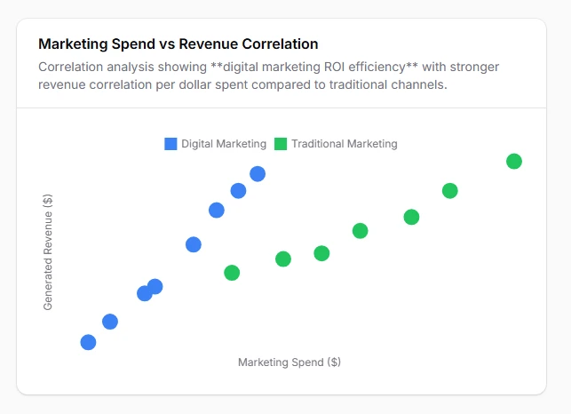
Reveal hidden relationships and correlations between two continuous variables using scatter plots that help identify trends, outliers, and data clusters. Essential for statistical analysis, quality control, and predictive modeling where understanding variable relationships drives business decisions.
class PerformanceCorrelationChart extends ChartWidget
{
    protected ?string $heading = 'Marketing Spend vs Revenue Correlation';

    protected function getData(): array
    {
        return [
            'datasets' => [
                [
                    'label' => 'Digital Marketing',
                    'data' => [
                        ['x' => 12000, 'y' => 245000],
                        ['x' => 8500, 'y' => 189000],
                        ['x' => 15000, 'y' => 312000],
                        ['x' => 20000, 'y' => 425000],
                        ['x' => 6800, 'y' => 156000],
                        ['x' => 18500, 'y' => 398000],
                        ['x' => 11200, 'y' => 234000],
                        ['x' => 16800, 'y' => 367000],
                    ],
                    'backgroundColor' => 'rgba(59, 130, 246, 0.6)',
                    'borderColor' => 'rgb(59, 130, 246)',
                    'pointBackgroundColor' => 'rgb(59, 130, 246)',
                    'borderWidth' => 2,
                    'pointRadius' => 8,
                    'pointHoverRadius' => 10,
                ],
                [
                    'label' => 'Traditional Marketing',
                    'data' => [
                        ['x' => 25000, 'y' => 298000],
                        ['x' => 32000, 'y' => 356000],
                        ['x' => 18000, 'y' => 267000],
                        ['x' => 28000, 'y' => 334000],
                        ['x' => 22000, 'y' => 289000],
                        ['x' => 35000, 'y' => 398000],
                        ['x' => 40000, 'y' => 445000],
                    ],
                    'backgroundColor' => 'rgba(34, 197, 94, 0.6)',
                    'borderColor' => 'rgb(34, 197, 94)',
                    'pointBackgroundColor' => 'rgb(34, 197, 94)',
                    'borderWidth' => 2,
                    'pointRadius' => 8,
                    'pointHoverRadius' => 10,
                ],
            ],
        ];
    }

    protected function getType(): string
    {
        return 'scatter';
    }

    protected function getOptions(): array
    {
        return [
            'scales' => [
                'x' => [
                    'type' => 'linear',
                    'position' => 'bottom',
                    'title' => [
                        'display' => true,
                        'text' => 'Marketing Spend ($)',
                    ],
                    'ticks' => [
                        'callback' => 'function(value) { return "$" + (value/1000) + "K"; }',
                    ],
                ],
                'y' => [
                    'title' => [
                        'display' => true,
                        'text' => 'Generated Revenue ($)',
                    ],
                    'ticks' => [
                        'callback' => 'function(value) { return "$" + (value/1000) + "K"; }',
                    ],
                ],
            ],
            'plugins' => [
                'tooltip' => [
                    'callbacks' => [
                        'label' => 'function(context) { return context.dataset.label + " - Spend: $" + context.parsed.x.toLocaleString() + ", Revenue: $" + context.parsed.y.toLocaleString(); }',
                    ],
                ],
                'legend' => [
                    'position' => 'top',
                ],
            ],
        ];
    }

    public function getDescription(): ?string
    {
        return 'Correlation analysis showing **digital marketing ROI efficiency** with stronger revenue correlation per dollar spent compared to traditional channels.';
    }
}
# Bubble chart for three-dimensional analysis
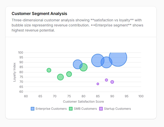
Visualize complex relationships across three data dimensions simultaneously using bubble charts where x-axis, y-axis, and bubble size each represent different metrics. Perfect for customer segmentation, product portfolio analysis, and risk assessment requiring multi-dimensional insights.
class CustomerSegmentChart extends ChartWidget
{
    protected ?string $heading = 'Customer Segment Analysis';

    protected function getData(): array
    {
        return [
            'datasets' => [
                [
                    'label' => 'Enterprise Customers',
                    'data' => [
                        ['x' => 85, 'y' => 92, 'r' => 25], // Satisfaction vs Loyalty, bubble = Revenue
                        ['x' => 78, 'y' => 88, 'r' => 18],
                        ['x' => 92, 'y' => 95, 'r' => 35],
                        ['x' => 88, 'y' => 90, 'r' => 22],
                    ],
                    'backgroundColor' => 'rgba(59, 130, 246, 0.6)',
                    'borderColor' => 'rgb(59, 130, 246)',
                    'pointBackgroundColor' => 'hsla(217, 91%, 60%, 0.5)',
                    'borderWidth' => 2,
                ],
                [
                    'label' => 'SMB Customers',
                    'data' => [
                        ['x' => 72, 'y' => 75, 'r' => 12],
                        ['x' => 68, 'y' => 82, 'r' => 8],
                        ['x' => 80, 'y' => 85, 'r' => 15],
                        ['x' => 75, 'y' => 78, 'r' => 10],
                    ],
                    'backgroundColor' => 'rgba(34, 197, 94, 0.6)',
                    'borderColor' => 'rgb(34, 197, 94)',
                    'pointBackgroundColor' => 'rgba(34, 197, 94, 0.5)',
                    'borderWidth' => 2,
                ],
                [
                    'label' => 'Startup Customers',
                    'data' => [
                        ['x' => 90, 'y' => 70, 'r' => 6],
                        ['x' => 85, 'y' => 68, 'r' => 4],
                        ['x' => 88, 'y' => 72, 'r' => 5],
                    ],
                    'backgroundColor' => 'rgba(168, 85, 247, 0.6)',
                    'borderColor' => 'rgb(168, 85, 247)',
                    'pointBackgroundColor' => 'rgba(169, 85, 247, 0.5)',
                    'borderWidth' => 2,
                ],
            ],
        ];
    }

    protected function getType(): string
    {
        return 'bubble';
    }

    protected function getOptions(): array
    {
        return [
            'scales' => [
                'x' => [
                    'title' => [
                        'display' => true,
                        'text' => 'Customer Satisfaction Score',
                    ],
                    'min' => 60,
                    'max' => 100,
                ],
                'y' => [
                    'title' => [
                        'display' => true,
                        'text' => 'Loyalty Index',
                    ],
                    'min' => 60,
                    'max' => 100,
                ],
            ],
            'plugins' => [
                'tooltip' => [
                    'callbacks' => [
                        'label' => 'function(context) { return context.dataset.label + " - Satisfaction: " + context.parsed.x + ", Loyalty: " + context.parsed.y + ", Revenue: $" + (context.parsed.r * 10) + "K"; }',
                    ],
                ],
            ],
        ];
    }

    public function getDescription(): ?string
    {
        return 'Three-dimensional customer analysis showing **satisfaction vs loyalty** with bubble size representing revenue contribution. **Enterprise segment** shows highest revenue potential.';
    }
}