
Button Variations
Transform simple clicks into powerful user interactions with Filament's comprehensive button system. Beyond basic styling, Filament buttons provide intelligent state management, responsive behavior, and seamless integration with actions, modals, and user workflows. From subtle link-style triggers to prominent call-to-action buttons with loading states and keyboard shortcuts, these components handle everything from simple navigation to complex multi-step operations.
# Basic button styles
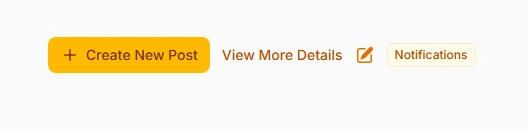
Choose from four distinct button styles that serve different interaction patterns. Button style provides full prominence with background color, link style offers subtle text-only interaction, icon button creates compact circular triggers, and badge style combines visual indicators with clickable functionality.
Action::make('create')
    ->button()
    ->label('Create New Post')
    ->icon('heroicon-m-plus'),

// Subtle link-style button
Action::make('viewMore')
    ->link()
    ->label('View More Details')
    ->url('https://filament-hub.com'),

// Compact icon-only button
Action::make('edit')
    ->iconButton()
    ->icon('heroicon-m-pencil-square')
    ->tooltip('Edit this record'),

// Badge-style with counter
Action::make('notifications')
    ->badge()
    ->label('Notifications')
    ->badge(5)
    ->badgeColor('danger')
# Color-coded significance
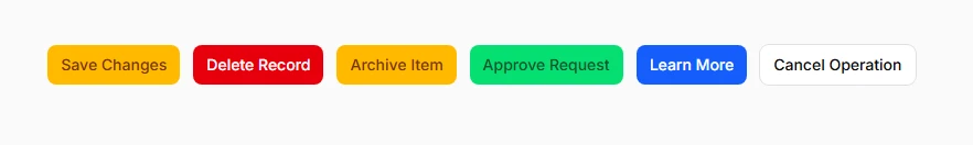
Use semantic color coding to communicate button importance and action consequences. Filament provides six built-in colors that maintain consistency across your application while clearly indicating the nature of each action to users.
Action::make('save')
    ->color('primary')
    ->label('Save Changes'),

Action::make('delete')
    ->color('danger')
    ->label('Delete Record')
    ->requiresConfirmation(),

Action::make('archive')
    ->color('warning')
    ->label('Archive Item'),

Action::make('approve')
    ->color('success')
    ->label('Approve Request'),

Action::make('moreInfo')
    ->color('info')
    ->label('Learn More'),

Action::make('cancel')
    ->color('gray')
    ->label('Cancel Operation')
# Size variations for hierarchy

Create visual hierarchy through strategic button sizing. Different sizes help establish importance levels and optimize space usage, especially useful in tables, forms, and mobile interfaces where space is premium.
// Small buttons for table rows and compact interfaces
Action::make('quickEdit')
    ->size('sm')
    ->label('Quick Edit')
    ->icon('heroicon-m-pencil-square'),

// Medium buttons for standard interface elements (default)
Action::make('submit')
    ->size('md')
    ->label('Submit Form'),

// Large buttons for primary calls-to-action
Action::make('startTrial')
    ->size('lg')
    ->label('Start Free Trial')
    ->icon('heroicon-m-rocket-launch')
# Icon integration and positioning
Enhance visual communication with strategic icon placement. Icons provide instant recognition and can be positioned before or after text, or used alone for compact interfaces. Proper icon choice reinforces the action's purpose.
use Filament\Support\Enums\IconPosition;

// Icon before text (default)
Action::make('download')
    ->label('Download Report')
    ->icon('heroicon-m-arrow-down-tray'),

// Icon after text for directional actions
Action::make('continue')
    ->label('Continue to Next Step')
    ->icon('heroicon-m-arrow-right')
    ->iconPosition(IconPosition::After),

// Icon-only button with tooltip
Action::make('favorite')
    ->iconButton()
    ->icon('heroicon-m-heart')
    ->tooltip('Add to Favorites'),

// Multiple icon styles for different states
Action::make('toggle')
    ->iconButton()
    ->icon(fn ($record) => $record->is_active
        ? 'heroicon-m-pause'
        : 'heroicon-m-play')
# Outlined styling for subtlety

Create less prominent buttons that maintain functionality without overwhelming the interface. Outlined buttons work perfectly for secondary actions, cancel buttons, or situations where multiple buttons need to coexist without competing for attention.
// Outlined primary button for secondary actions
Action::make('preview')
    ->button()
    ->outlined()
    ->label('Preview Changes')
    ->icon('heroicon-m-eye'),

// Outlined danger button for destructive actions
Action::make('reset')
    ->color('danger')
    ->outlined()
    ->label('Reset to Default')
    ->requiresConfirmation(),

// Combine outlined with different colors
Action::make('draft')
    ->color('gray')
    ->outlined()
    ->label('Save as Draft')
# Loading states and disabled conditions
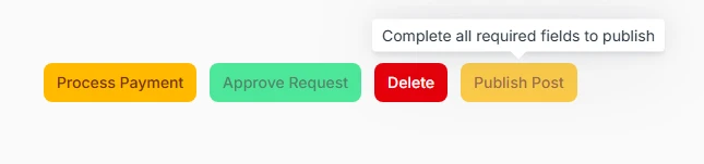
Provide clear feedback during operations and control button availability based on user permissions or application state. Loading states prevent double-submissions while disabled states communicate when actions aren't available.
// Button with loading state during action execution
Action::make('processPayment')
    ->label('Process Payment')
    ->action(function () {
        // Long-running operation
        $this->processPayment();
    })
    ->requiresConfirmation(),

// Conditionally disabled based on permissions
Action::make('approve')
    ->label('Approve Request')
    ->disabled(fn ($record) => !auth()->user()->can('approve', $record))
    ->color('success'),

// Hidden entirely for unauthorized users
Action::make('delete')
    ->label('Delete')
    ->visible(auth()->user()->can('delete', $this->post))
    ->color('danger'),

// Disabled with explanatory tooltip
Action::make('publish')
    ->label('Publish Post')
    ->disabled(fn ($record) => !$record->is_complete)
    ->tooltip(fn ($record) => $record->is_complete
        ? null
        : 'Complete all required fields to publish')
# Button groups for organization
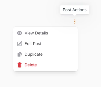
Organize related actions into space-efficient dropdown menus. Action groups reduce interface clutter while keeping all necessary actions accessible, particularly valuable in table rows and compact layouts.
use Filament\Actions\ActionGroup;

ActionGroup::make([
    Action::make('view')
        ->label('View Details')
        ->icon('heroicon-m-eye')
        ->url(fn ($record) => route('posts.show', $record)),

    Action::make('edit')
        ->label('Edit Post')
        ->icon('heroicon-m-pencil-square')
        ->url(fn ($record) => route('posts.edit', $record)),

    Action::make('duplicate')
        ->label('Duplicate')
        ->icon('heroicon-m-document-duplicate')
        ->action(fn ($record) => $this->duplicate($record)),

    Action::make('delete')
        ->label('Delete')
        ->icon('heroicon-m-trash')
        ->color('danger')
        ->requiresConfirmation()
])
->size('sm')
->tooltip('Post Actions'),
# Responsive label behavior
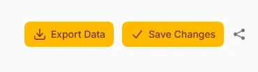
Optimize mobile experiences by intelligently hiding labels on smaller screens while maintaining icon recognition. This approach preserves functionality while maximizing available space on mobile devices.
// Label visible from medium screens up, icon-only on mobile
Action::make('exportData')
    ->label('Export Data')
    ->icon('heroicon-m-arrow-down-tray')
    ->button()
    ->labeledFrom('md'),

// Always show label for critical actions
Action::make('save')
    ->label('Save Changes')
    ->icon('heroicon-m-check')
    ->color('primary'),

// Hide labels for secondary actions on small screens
Action::make('share')
    ->label('Share Post')
    ->icon('heroicon-m-share')
    ->labeledFrom('lg')
    ->color('gray')
# Badge integration and counters
Communicate additional context through visual indicators attached to buttons. Badges work excellently for notification counts, status indicators, or any scenario where supplementary information enhances the button's meaning.
// Notification button with unread count
Action::make('notifications')
    ->iconButton()
    ->icon('heroicon-m-bell')
    ->badge(fn () => auth()->user()->unreadNotifications()->count())
    ->badgeColor('danger')
    ->tooltip('View Notifications'),

// Status indicator badge
Action::make('systemHealth')
    ->label('System Status')
    ->badge('Online')
    ->badgeColor('success')
    ->icon('heroicon-m-server'),

// Dynamic badge based on data
Action::make('pendingApprovals')
    ->label('Pending Reviews')
    ->badge(fn () => $this->getPendingCount())
    ->badgeColor(fn () => $this->getPendingCount() > 0 ? 'warning' : 'gray')
# Interactive keyboard shortcuts

Enhance power user productivity with keyboard shortcuts that provide quick access to frequently used actions. Shortcuts use familiar key combinations and work across different operating systems.
// Save action with Ctrl+S / Cmd+S
Action::make('save')
    ->label('Save Changes')
    ->action(fn () => $this->save())
    ->keyBindings(['mod+s']),

// Create new with Ctrl+N / Cmd+N
Action::make('create')
    ->label('Create New')
    ->keyBindings(['mod+n'])
    ->icon('heroicon-m-plus'),

// Multiple key combinations for the same action
Action::make('search')
    ->label('Search')
    ->keyBindings(['mod+k', 'ctrl+f'])
    ->icon('heroicon-m-magnifying-glass'),

// Complex combinations for advanced actions
Action::make('quickSave')
    ->label('Quick Save & Continue')
    ->keyBindings(['mod+shift+s'])
    ->action(fn () => $this->saveAndContinue())