
Basic Input Fields
Master the foundational elements of Filament's form system with basic input fields that cover a wide range of user input scenarios. From text inputs and textareas to select fields and booleans, this section shows how to configure common components with features like validation rules, autocomplete, input masking, and read-only states. Learn how to build intuitive forms with mobile-optimized inputs, relationship-based selects, and modern boolean toggles that work seamlessly across use cases.
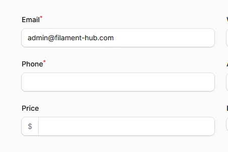
Text Inputs
Transform simple text collection into powerful, intelligent input experiences with Filament's comprehensive text input component. From basic string capture to sophisticated validation, dynamic masking, and smart autocomplete
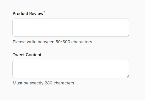
TextArea Fields
Multi-line text areas in Filament go far beyond basic HTML textareas, offering intelligent auto-sizing, robust validation, and seamless integration with Livewire's reactive capabilities...

Select Fields
The select component transforms simple dropdown functionality into a powerful data selection interface with advanced features like searching, relationship handling, and dynamic option creation...
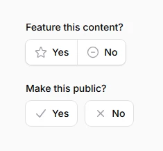
Boolean Fields
Whether you need simple on/off switches, traditional checkboxes, or sophisticated conditional form logic, Filament's boolean field components provide the flexibility and user experience modern applications demand...
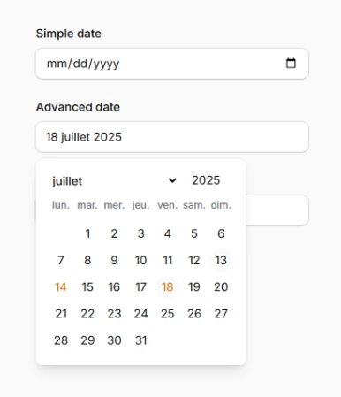
Date/Time Inputs
Filament's date and time input components provide a comprehensive suite of temporal data collection tools that seamlessly adapt to your application's needs, offering both native HTML5 and enhanced JavaScript picker experiences...