
Header Actions
Transform your table headers from static displays into powerful command centers with Filament's comprehensive header action system. Whether you need simple create buttons, complex import workflows, or sophisticated bulk operations, header actions provide the perfect staging area for table-level operations that aren't tied to specific rows. From single-click shortcuts to multi-step wizards, these actions turn your table headers into intuitive control panels that users naturally expect to find.
# Basic Create Actions
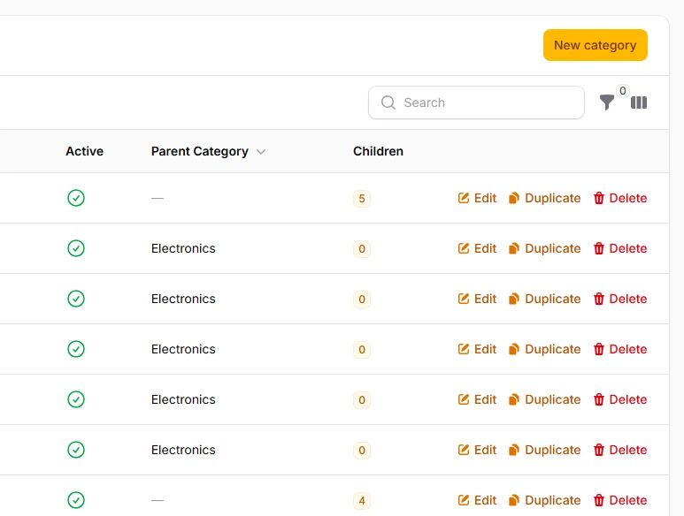
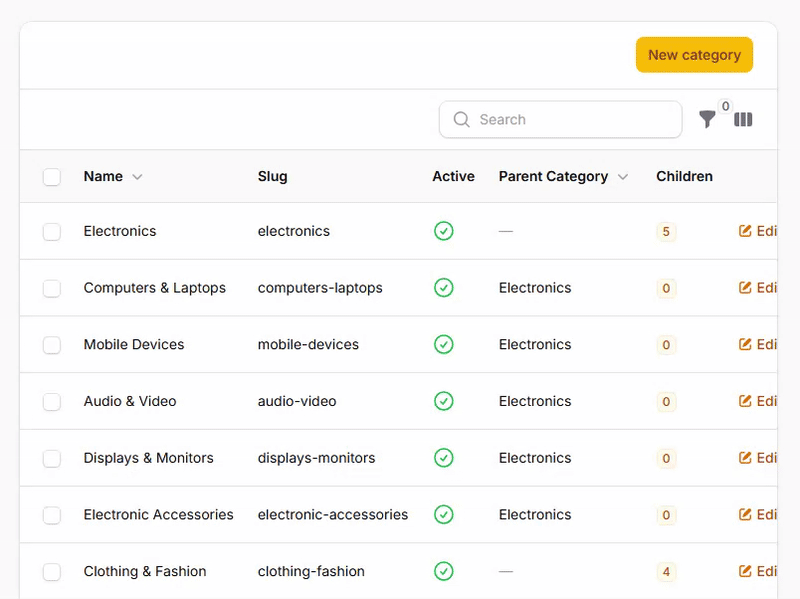
The most common header action - a straightforward button to create new records. Filament's prebuilt CreateAction handles the entire workflow from form display to validation and saving, with smart defaults that work immediately while remaining fully customizable.
->headerActions([
    CreateAction::make()
        ->schema([
            TextInput::make('title')
                ->required()
                ->maxLength(255),
            TextInput::make('slug')
                ->required()
                ->unique(),
            Textarea::make('content')
                ->rows(5),
        ]),
    ]);
# Bulk Actions in Header
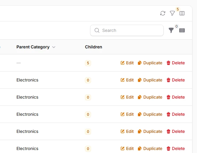
Move bulk actions from the traditional dropdown into the header for better visibility and accessibility. Header bulk actions remain disabled until rows are selected, providing clear visual feedback about their availability.
->headerActions([
    CreateAction::make()
        ->schema([
            // ...
        ]),
    BulkAction::make('setParent')
        ->label('Set Parent Category')
        ->icon('heroicon-o-folder-plus')
        ->color('info')
        ->schema([
            // ...
        ])
        ->action(function (Collection $records, array $data) {
            // ...
        }),
    ]);
# Action Groups
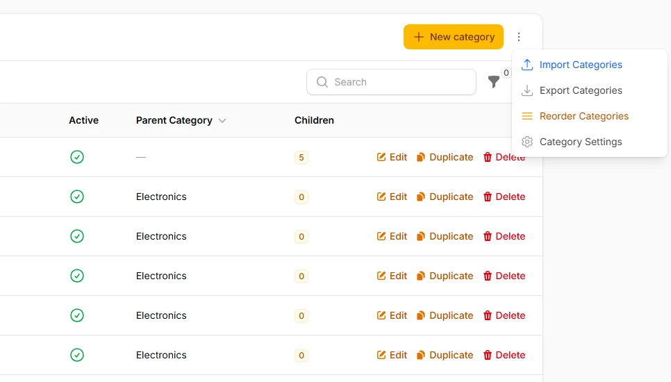
Organize multiple related actions into clean dropdown menus to save space while maintaining easy access. Action groups can mix different action types and maintain their individual styling and behavior.
->headerActions([
    CreateAction::make()
        ->model(Category::class)
        ->icon('heroicon-o-plus')
        ->color('primary'),

    ActionGroup::make([
        Action::make('import')
            ->label('Import Categories')
            ->icon('heroicon-o-arrow-up-tray')
            ->color('info'),

        Action::make('export')
            ->label('Export Categories')
            ->icon('heroicon-o-arrow-down-tray')
            ->color('gray'),

        Action::make('settings')
            ->label('Category Settings')
            ->icon('heroicon-o-cog-6-tooth')
            ->color('gray'),
    ])
    ->label('More Actions')
    ->icon('heroicon-o-ellipsis-vertical')
    ->color('gray'),
]);
# Icon-Only Actions
Maximize space efficiency with icon-only buttons that rely on tooltips for context. Perfect for secondary actions or when working with limited header space, especially on mobile devices.
->headerActions([
    Action::make('refresh')
        ->icon('heroicon-o-arrow-path')
        ->iconButton()
        ->tooltip('Refresh Data')
        ->color('gray')
        ->action(function () {
            // ...
        }),

    Action::make('filters')
        ->icon('heroicon-o-funnel')
        ->iconButton()
        ->tooltip('Toggle Filters')
        ->color('gray')
        ->badge(function () {
            // ...
        })
        ->badgeColor('primary'),

    Action::make('columns')
        ->icon('heroicon-o-view-columns')
        ->iconButton()
        ->tooltip('Manage Columns')
        ->color('gray'),
]);