
Section Components
Form sections provide a powerful way to organize and structure complex forms by grouping related fields together with meaningful headers, descriptions, and visual styling. Rather than presenting users with overwhelming single-column layouts, sections create logical information hierarchies that guide users through data entry while maintaining clean, scannable interfaces. From simple content grouping to sophisticated collapsible panels with persistent state, sections transform unwieldy forms into intuitive, user-friendly experiences.
# Basic section structure
Create organized content groups with clear headers and descriptive text that help users understand each section's purpose. Sections can include meaningful headers and descriptions, or function as simple card containers for visual separation. This fundamental building block ensures your forms remain scannable and logically structured, preventing cognitive overload in complex data entry scenarios.
use Filament\Schemas\Components\Section;
// Section with header and description
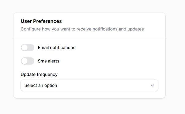
Section::make('User Preferences')
->description('Configure how you want to receive notifications and updates')
->schema([
Toggle::make('email_notifications'),
Toggle::make('sms_alerts'),
Select::make('update_frequency'),
])
# Icon integration
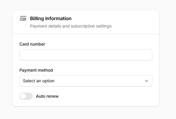
Add visual context and improved scannability to section headers using Heroicons or custom SVG icons. Icons provide immediate visual recognition and help users quickly identify different types of content. The consistent iconography creates a more polished interface while improving accessibility through visual cues that complement textual information.
use Filament\Schemas\Components\Section;
use Filament\Support\Icons\Heroicon;

Section::make('Billing Information')
    ->description('Payment details and subscription settings')
    ->icon(Heroicon::CreditCard)
    ->schema([
        TextInput::make('card_number'),
        Select::make('payment_method'),
        Toggle::make('auto_renew'),
    ]),
# Collapsible sections
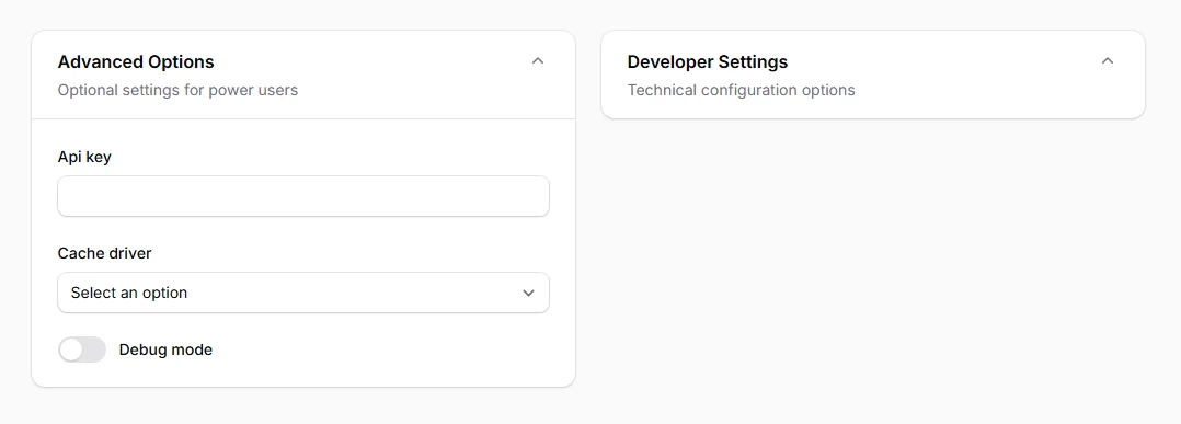
Manage long form complexity by allowing users to show or hide section content on demand. Collapsible sections reduce visual clutter while preserving access to all functionality. Users can focus on relevant information while keeping other sections minimized, creating a more manageable and less overwhelming form experience.
use Filament\Schemas\Components\Section;

Section::make('Advanced Options')
    ->description('Optional settings for power users')
    ->schema([
        TextInput::make('api_key'),
        Select::make('cache_driver'),
        Toggle::make('debug_mode'),
    ])
    ->collapsible()

// Start collapsed by default
Section::make('Developer Settings')
    ->description('Technical configuration options')
    ->schema([
        Textarea::make('custom_css'),
        Textarea::make('custom_js'),
        Toggle::make('maintenance_mode'),
    ])
    ->collapsible()
    ->collapsed()
# Aside positioning
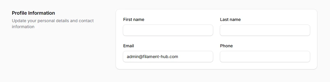
Create sophisticated two-column layouts where section headers and descriptions appear on the left while form content displays in a card on the right. This layout maximizes screen real estate and creates visually appealing forms that guide the eye naturally from descriptive content to interactive elements, particularly effective for wide screen displays.
use Filament\Schemas\Components\Section;

Section::make('Profile Information')
    ->description('Update your personal details and contact information')
    ->aside()
    ->schema([
        TextInput::make('first_name'),
        TextInput::make('last_name'),
        TextInput::make('email'),
        TextInput::make('phone'),
    ])
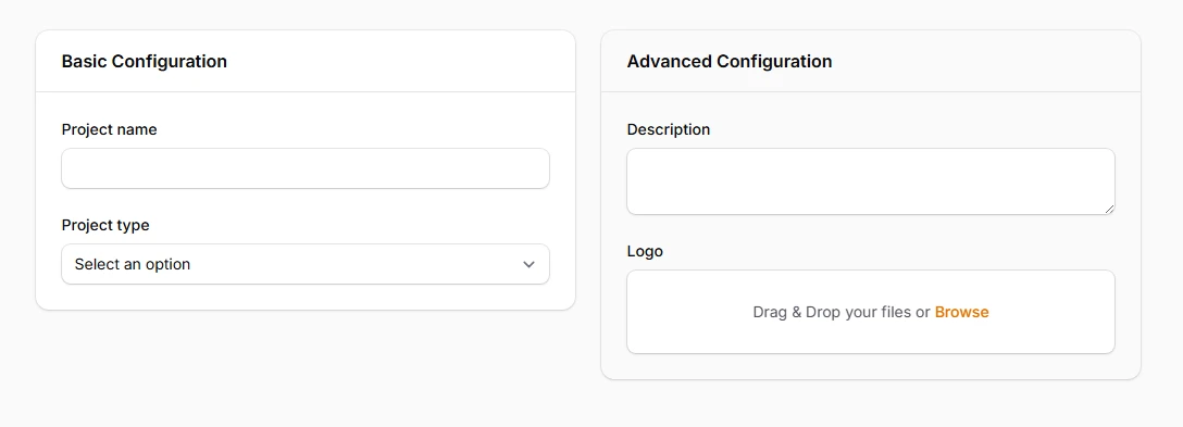
# Secondary styling

Apply subtle background variations that provide better visual separation when sections are nested within other sections. Secondary styling prevents visual confusion by using less contrasting backgrounds, ensuring clear content hierarchy while maintaining readability and aesthetic consistency throughout complex form layouts.
use Filament\Schemas\Components\Section;

Section::make('Basic Configuration')
    ->schema([
        TextInput::make('project_name'),
        Select::make('project_type'),
    ]),

Section::make('Advanced Configuration')
    ->schema([
        Textarea::make('description'),
        FileUpload::make('logo'),
    ])
    ->secondary(),
# Header and footer actions
Embed contextual action buttons directly within section headers or footers for immediate access to related functionality. This pattern reduces cognitive load by placing actions exactly where users expect them, creating intuitive workflow patterns that enhance productivity and maintain focus within specific form sections.
use Filament\Schemas\Components\Section;
use Filament\Actions\Action;

Section::make('API Configuration')
    ->description('Manage your API keys and endpoints')
    ->afterHeader([
        Action::make('generateKey')
            ->label('Generate New Key')
            ->icon('heroicon-o-key')
            ->action(fn () => $this->generateApiKey()),
    ])
    ->schema([
        TextInput::make('api_key')->disabled(),
        TextInput::make('api_endpoint'),
    ])
    ->footer([
        Action::make('testConnection')
            ->label('Test API Connection')
            ->action(fn () => $this->testApiConnection()),
    ])