
Date/Time Inputs
Filament's date and time input components provide a comprehensive suite of temporal data collection tools that seamlessly adapt to your application's needs. Whether you need simple date selection, precise datetime scheduling, or complex timezone-aware temporal workflows, these components offer both native HTML5 and enhanced JavaScript picker experiences with extensive customization options. From automatic timezone conversion to dynamic validation rules, Filament's temporal inputs handle the complexity of date and time management while maintaining an intuitive user experience across all device types.
# Basic date, time, and datetime pickers
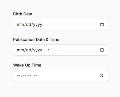
The three core temporal input components provide clean, accessible interfaces for collecting different types of time-based data. Each component handles its specific temporal scope while sharing common customization options and validation capabilities.
use Filament\Forms\Components\DatePicker;
use Filament\Forms\Components\DateTimePicker;
use Filament\Forms\Components\TimePicker;

DatePicker::make('date_of_birth')
    ->label('Birth Date'),

DateTimePicker::make('published_at')
    ->label('Publication Date & Time'),

TimePicker::make('alarm_time')
    ->label('Wake Up Time'),
# Native vs JavaScript date picker modes
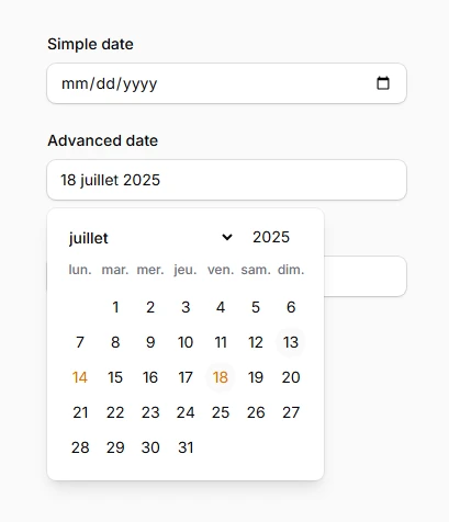
Switch between browser-native HTML5 pickers and feature-rich JavaScript alternatives depending on your interface requirements. Native pickers offer better keyboard accessibility and faster rendering, while JavaScript pickers provide advanced customization and consistent cross-browser appearance.
// Use native HTML5 date picker (default)
DatePicker::make('simple_date')
    ->native(true), // Default behavior

// Enable JavaScript date picker for advanced features
DatePicker::make('advanced_date')
    ->native(false)
    ->displayFormat('d F Y')
    ->locale('fr'),

DateTimePicker::make('event_start')
    ->native(false)
    ->closeOnDateSelection(), // Auto-close after date selection