
Column Types Gallery
The Column Types Gallery is your quick-scan encyclopedia of every built-in Filament 4.x table column. Each snippet shows the code you need plus a short “why it matters,” so you can drop the right column into your resource without hunting through the docs. From simple text, to inline-editable inputs, to color swatches, it’s all here in one place.
# Basic text column
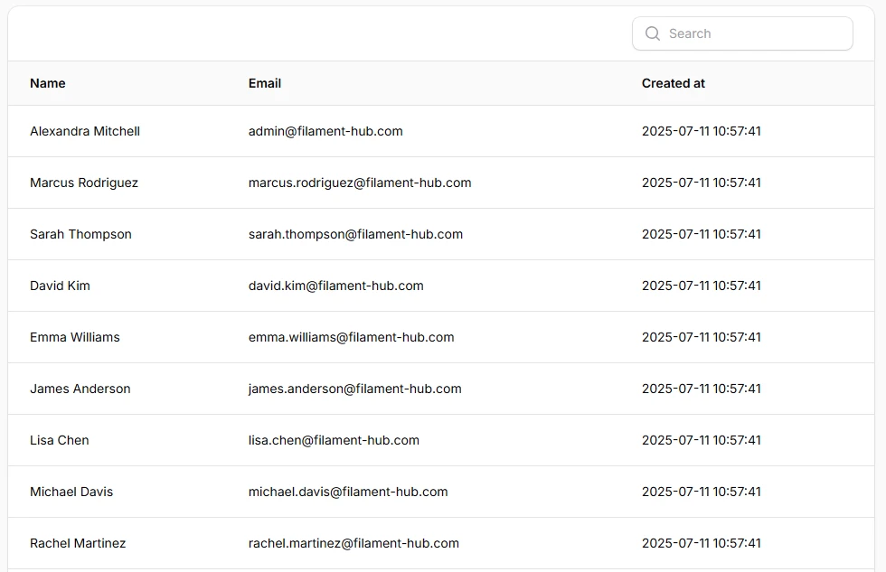
The workhorse for names, titles, and any plain string. Searchable and sortable out of the box.
<?php
namespace App\Filament\Resources\Users\Tables;

use Filament\Tables\Columns\TextColumn;
use Filament\Tables\Table;

class UsersTable
{
    public static function configure(Table $table): Table
    {
    return $table
        ->columns([
            TextColumn::make('name')
                ->searchable(),
            TextColumn::make('email')
                ->searchable(),
            TextColumn::make('created_at'),
        ]);
    }
}
# Text column with icon
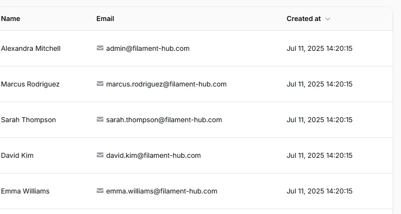
Adds a Heroicon before or after the text so users can instantly recognize what the value represents (e-mail, phone, link, etc.). You can also change the icon’s color separately from the text.
TextColumn::make('email')
    ->icon(Heroicon::Envelope),
# Text column - currency formatting
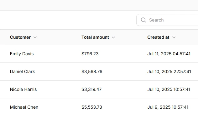
Show prices with proper currency symbols and thousands separators using money().
TextColumn::make('total_amount')
    ->money('USD')
    ->sortable(),
# Text column - badge style
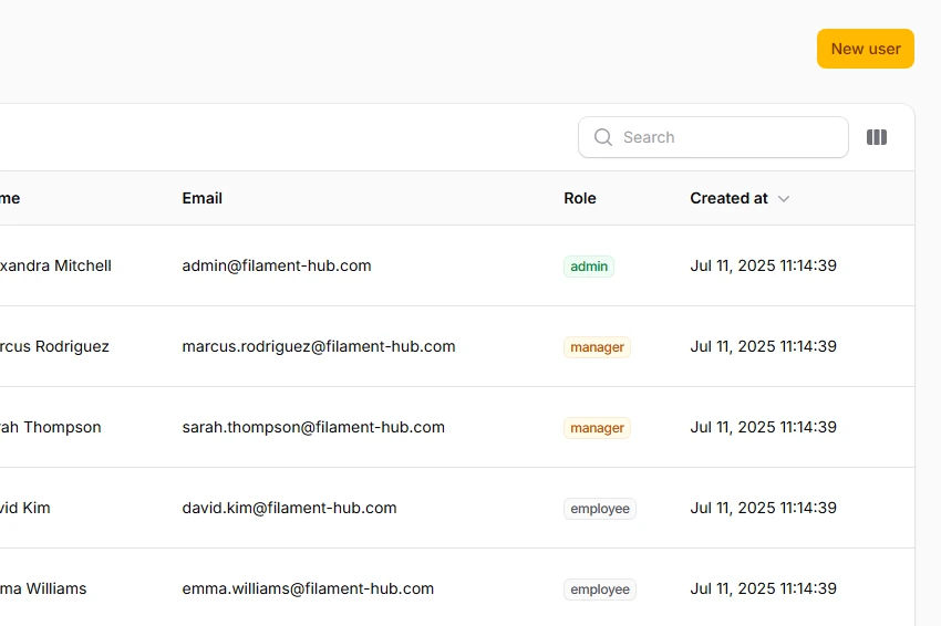
Turn plain text into a color-coded badge for statuses or tags.
TextColumn::make('role')
    ->badge()
    ->color(fn (string $state): string => match ($state) {
        'admin' => 'success',
        'manager' => 'warning',
        'employee' => 'gray',
    }),
# Text column with description
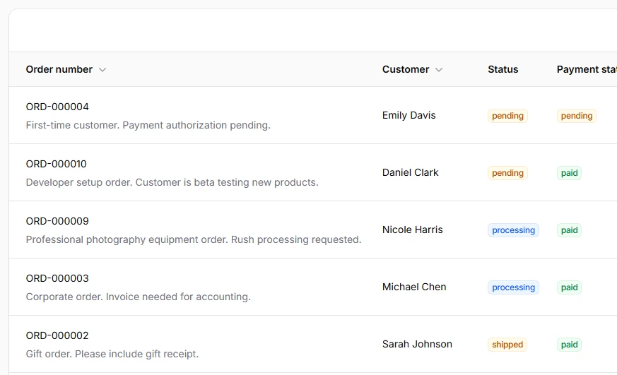
Shows a smaller line of helper text above or below the main cell value — perfect for subtitles, slugs, or contextual hints.
TextColumn::make('order_number')
    ->description(
        fn ($record) => $record->notes,
    ),
# Text column date / time
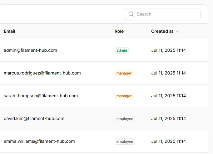
Human-friendly date formatting with one fluent call.
TextColumn::make('created_at')
    ->dateTime('M j, Y H:i')
    ->sortable(),
# Icon column (boolean)
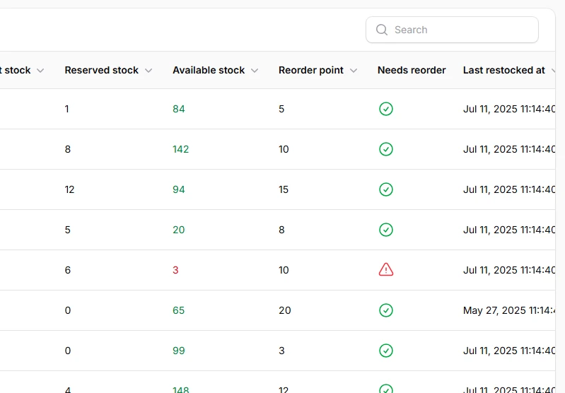
Displays ✔︎ / ✖︎ automatically for true/false flags.
IconColumn::make('needs_reorder')
    ->boolean()
    ->trueIcon('heroicon-o-exclamation-triangle')
    ->falseIcon('heroicon-o-check-circle')
    ->trueColor('danger')
    ->falseColor('success'),
# Image column
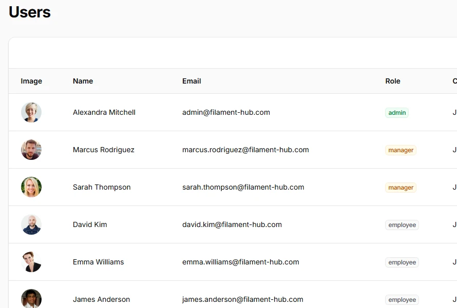
Perfect for product thumbnails or avatars. Accepts local disks or full URLs.
ImageColumn::make('image')
    ->circular(),
# Color column
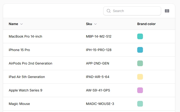
Renders a live color swatch next to a hex value.
ColorColumn::make('color')
    //You can make the column copyable to clipboard
    ->copyable()
    ->copyMessage('Brand color copied')
    ->copyMessageDuration(2000),
# Select column (inline enum editor)
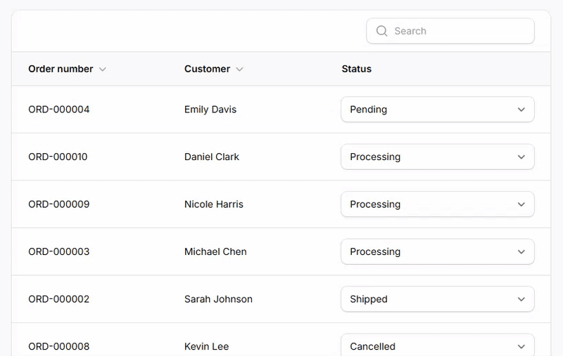
Lets users change a status directly in the table.
SelectColumn::make('status')
    ->options([
        'pending' => 'Pending',
        'processing' => 'Processing',
        'shipped' => 'Shipped',
        'delivered' => 'Delivered',
        'cancelled' => 'Cancelled',
    ])
    ->selectablePlaceholder(false),
# Toggle column (inline boolean editor)
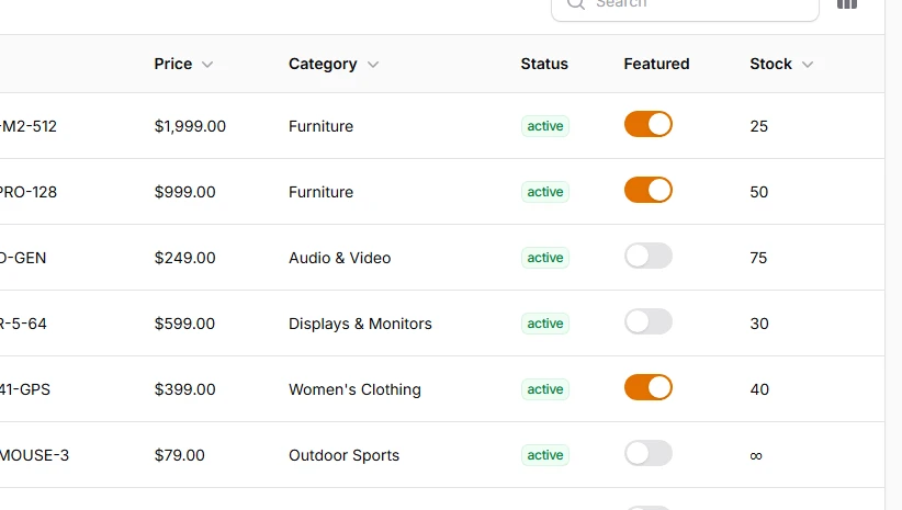
Slide switches for on/off features - changes are saved instantly.
ToggleColumn::make('featured')
# Checkbox column (inline boolean editor)
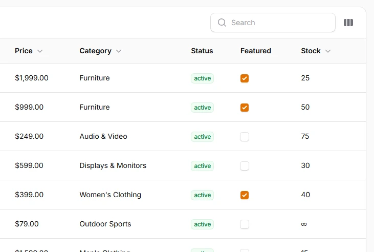
Adds a checkbox per row - working similarly like Toggle column.
CheckboxColumn::make('featured'),
# Text-input column (inline text editor)
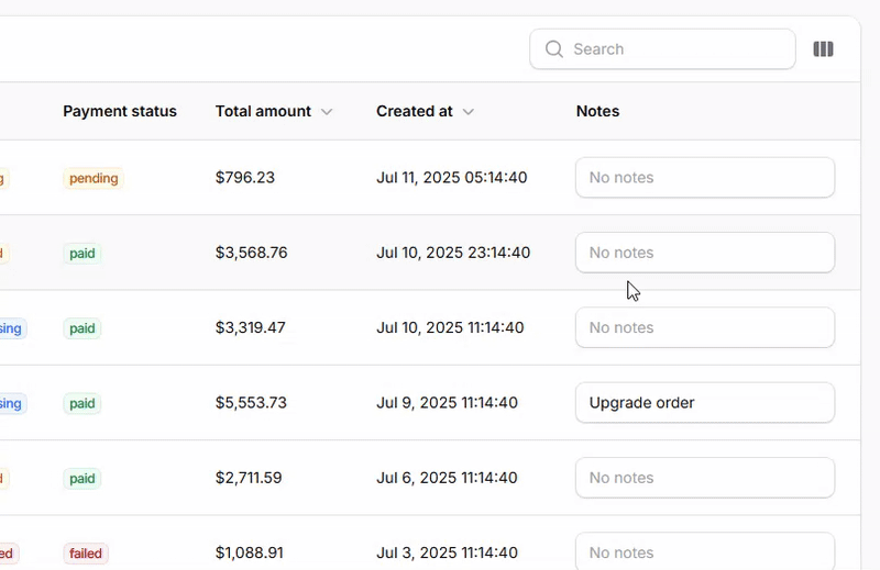
Great for quick notes or adjusting quantities without opening the edit form.
TextInputColumn::make('notes')
    ->placeholder('No notes'),