
Grid Layouts
Instead of manually wrestling with CSS layouts or settling for rigid form structures, Filament's grid system provides a powerful, flexible foundation for creating responsive multi-column layouts that adapt beautifully across all device sizes. From simple two-column forms to complex container-aware responsive designs, these layout tools give you pixel-perfect control over how your forms organize and present information.
# Basic responsive grid configuration
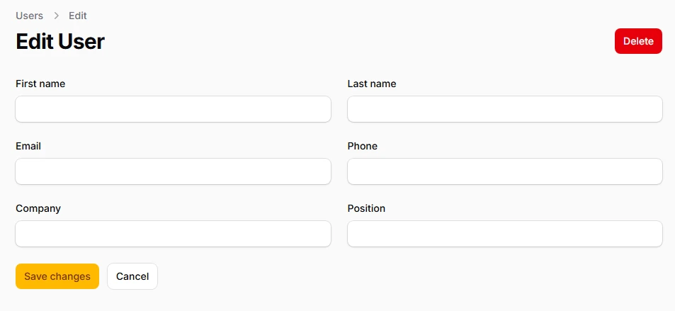
Create adaptive column layouts that automatically adjust based on screen size using Tailwind's standard breakpoints. The grid system intelligently falls back to single-column layouts on smaller devices while expanding to multi-column arrangements on larger screens.
use Filament\Schemas\Components\Grid;
use Filament\Forms\Components\TextInput;

Grid::make([
    'default' => 1,  // Mobile: 1 column
    'md' => 2,       // Tablets: 2 columns
    'lg' => 3,       // Desktop: 3 columns
    'xl' => 4,       // Large screens: 4 columns
    '2xl' => 6,      // Extra large: 6 columns
])
->schema([
    TextInput::make('first_name'),
    TextInput::make('last_name'),
    TextInput::make('email'),
    TextInput::make('phone'),
    TextInput::make('company'),
    TextInput::make('position'),
])
# Column spanning control
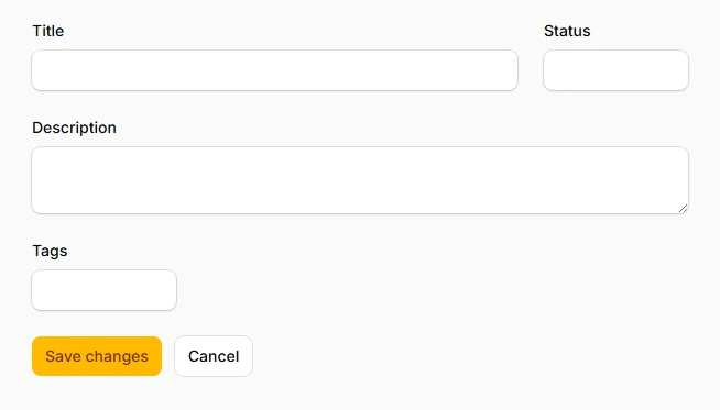
Precisely control how many columns each component occupies within the grid, allowing for sophisticated layouts where certain fields take up more space than others. Perfect for creating emphasis hierarchies and optimizing space usage.
use Filament\Schemas\Components\Grid;
use Filament\Forms\Components\TextInput;
use Filament\Forms\Components\Textarea;

Grid::make(4)
->schema([
    TextInput::make('title')
        ->columnSpan(3),  // Takes 3/4 of the width

    TextInput::make('status')
        ->columnSpan(1),  // Takes 1/4 of the width

    Textarea::make('description')
        ->columnSpanFull(),  // Takes full width

    TextInput::make('tags')
        ->columnSpan([
            'md' => 2,    // Half width on medium screens
            'xl' => 1,    // Quarter width on xl screens
        ]),
])
# Column starting position
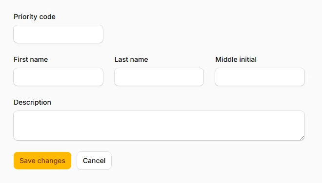
Position components at specific grid columns to create intentional whitespace or align fields with other layout elements. This gives you granular control over field placement and visual hierarchy.
use Filament\Schemas\Components\Grid;
use Filament\Forms\Components\TextInput;
use Filament\Forms\Components\Textarea;

Grid::make(3)
->schema([
    // Row 1: Single field starting at column 2 (creates left margin)
    TextInput::make('priority_code')
        ->columnSpan(1),

    // Row 2: Three fields filling all columns naturally
    TextInput::make('first_name')
        ->columnStart(1)
        ->columnSpan(1),
    TextInput::make('last_name')
        ->columnSpan(1),
    TextInput::make('middle_initial')
        ->columnSpan(1),

    // Row 3: Full-width textarea
    Textarea::make('description')
        ->columnSpanFull(),  // Spans all 3 columns
])
# Visual column ordering
Reorder components visually without changing their position in the markup, enabling responsive design patterns where field order changes based on screen size while maintaining proper form flow and accessibility.
use Filament\Schemas\Components\Grid;
use Filament\Forms\Components\TextInput;

Grid::make(3)
->schema([
    TextInput::make('first_name')
        ->columnOrder([
            'default' => 2,  // Second on mobile
            'lg' => 1,       // First on large screens
        ]),

    TextInput::make('last_name')
        ->columnOrder([
            'default' => 1,  // First on mobile
            'lg' => 2,       // Second on large screens
        ]),

    TextInput::make('email')
        ->columnOrder(3),    // Always third
])