
Colors
Transform your Filament admin panels with comprehensive color customization options that go far beyond basic theming. From simple color swaps using pre-built Tailwind palettes to sophisticated dynamic color switching systems, Filament provides multiple approaches to match your brand identity and create cohesive user experiences. Whether you need quick setup with built-in colors or advanced CSS variable systems for multi-tenant applications, these tools let you create visually stunning admin interfaces that align perfectly with your design requirements.
# Pre-built Tailwind color palettes
Leverage Tailwind's comprehensive color system with over 20 professionally designed color palettes, each containing 10 carefully crafted shades. The Color class provides instant access to all Tailwind colors, ensuring consistent color relationships and accessibility compliance across your interface.
use Filament\Panel;
use Filament\Support\Colors\Color;
public function panel(Panel $panel): Panel
{
return $panel
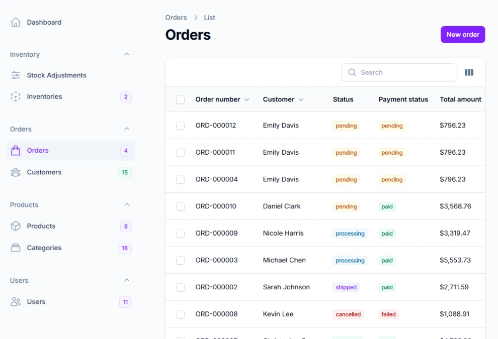
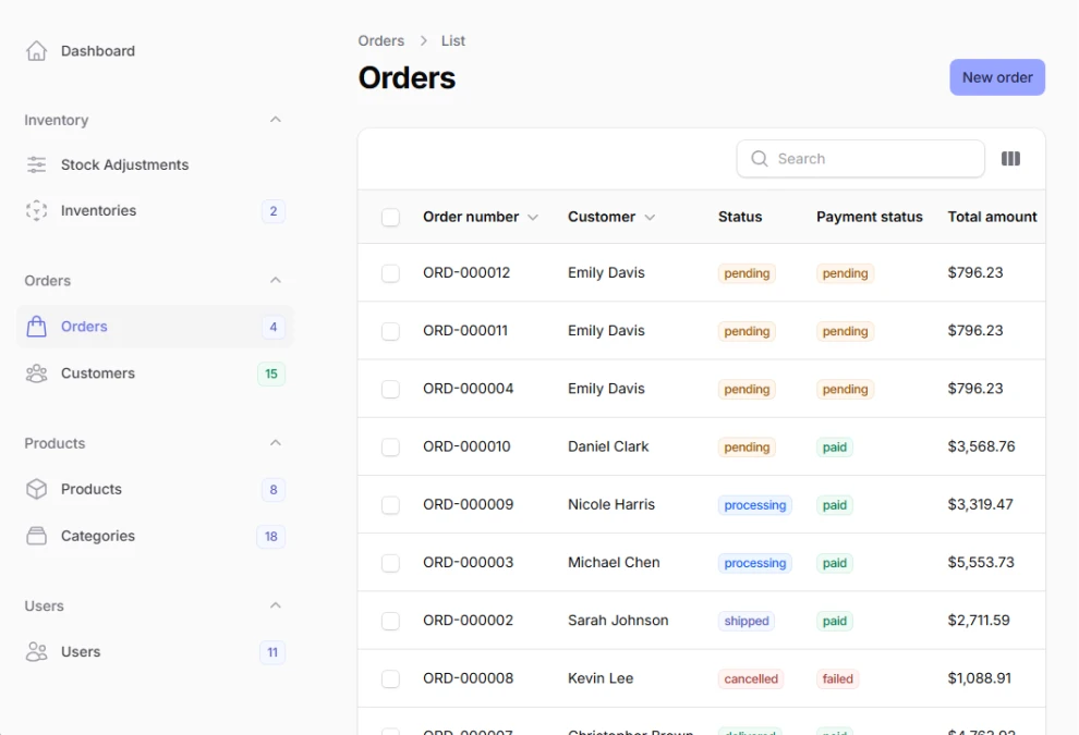
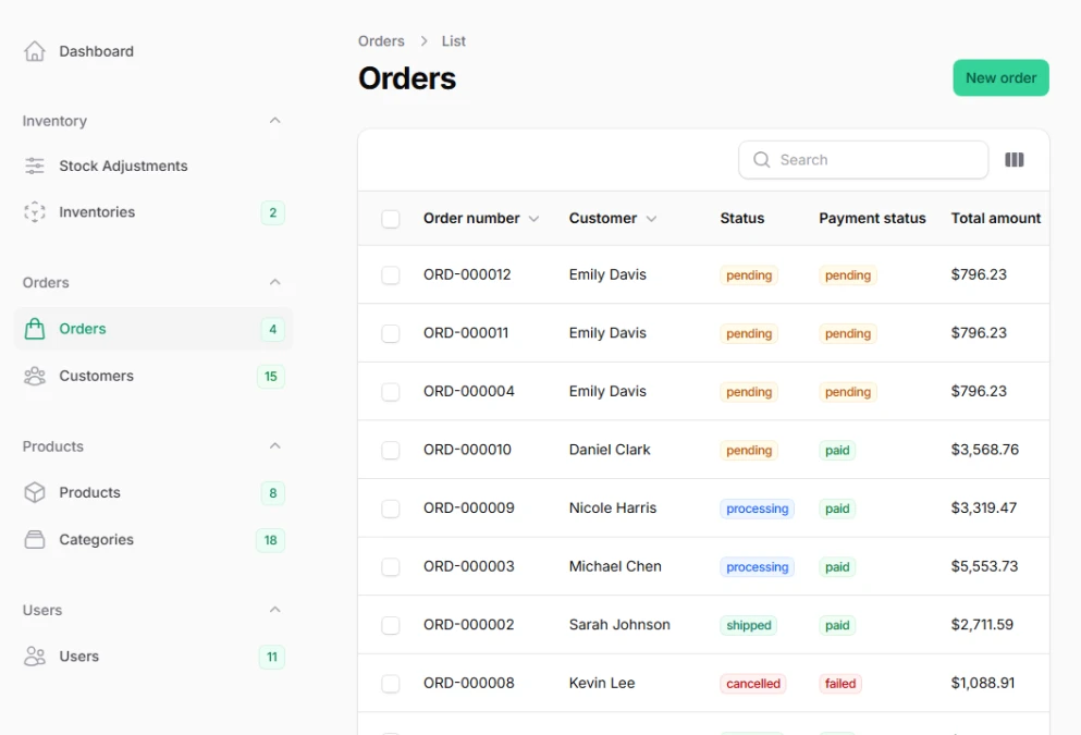
->colors([
'primary' => Color::Violet, // Modern purple tones
'success' => Color::Emerald, // Professional green
'warning' => Color::Amber, // Attention-grabbing orange
'danger' => Color::Red, // Clear error indication
'info' => Color::Sky, // Friendly information blue
'gray' => Color::Slate, // Sophisticated neutrals
]);
}
# Custom hex color generation
Generate complete color palettes from a single hex value using Filament's intelligent color generation algorithm. This creates harmonious shade variations automatically, maintaining proper contrast ratios and visual consistency across light and dark themes without manual color calculations.
use Filament\Panel;
use Filament\Support\Colors\Color;

public function panel(Panel $panel): Panel
{
    return $panel
        ->colors([
            'primary' => Color::hex('#6366f1'),     // Generates 50-950 shades
            'success' => Color::hex('#10b981'),     // Professional green
            'warning' => Color::hex('#f59e0b'),     // Warm amber
            'danger' => Color::hex('#ef4444'),      // Clear red
        ]);
}
# Manual color shade arrays
Define precise color scales with complete control over each shade from 50 to 950. This approach enables perfect brand color matching and ensures optimal contrast ratios for accessibility compliance across all interface elements and user interaction states.
use Filament\Panel;
use Filament\Support\Colors\Color;

public function panel(Panel $panel): Panel
{
    return $panel
        ->colors([
            'primary' => [
                50  => '#ecfdf5',  // Lightest background tint
                100 => '#d1fae5',  // Subtle backgrounds
                200 => '#a7f3d0',  // Light accents
                300 => '#6ee7b7',  // Disabled states
                400 => '#34d399',  // Secondary buttons
                500 => '#10b981',  // Primary color
                600 => '#059669',  // Hover states
                700 => '#047857',  // Active states
                800 => '#065f46',  // Dark text
                900 => '#064e3b',  // Darkest elements
                950 => '#022c22',  // Maximum contrast
            ],
        ]);
}