
Sidebar Navigation
Filament's sidebar navigation system provides unprecedented flexibility for organizing your admin panel's navigation structure. From simple menu items to sophisticated multi-level hierarchies with collapsible groups, badges, and custom styling, Filament's navigation components adapt to any organizational structure while maintaining clean, intuitive user interfaces that scale beautifully across devices.
# Basic menu configuration
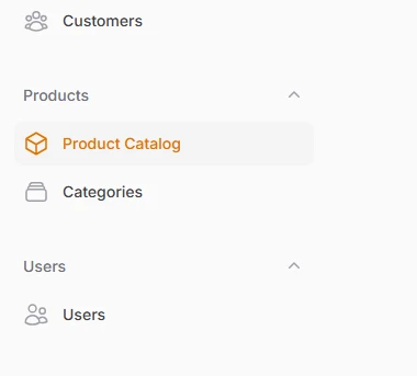
Set up fundamental navigation properties for resources and pages using simple class properties. Each navigation item automatically inherits sensible defaults while allowing complete customization of labels, icons, and positioning within your sidebar hierarchy.
class ProductResource extends Resource
{
protected static ?string $model = Product::class;
// Custom navigation label
protected static ?string $navigationLabel = 'Product Catalog';
// Navigation icon using Heroicon enum
protected static string|BackedEnum|null $navigationIcon = Heroicon::OutlinedCube;
// Position in navigation menu
protected static ?int $navigationSort = 1;
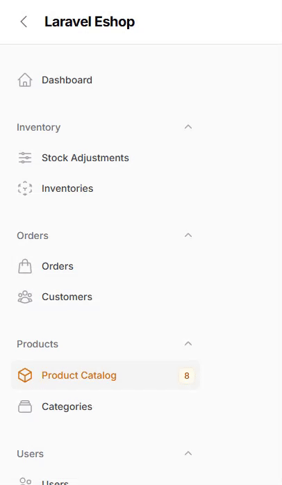
// Group products under "Products"
protected static string|UnitEnum|null $navigationGroup = 'Products';
# Collapsible navigation groups
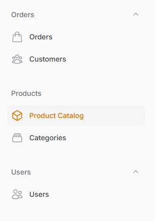
Organize related navigation items into visually distinct sections that can expand and collapse to reduce sidebar clutter. Groups support custom icons, default collapsed states, and intelligent hierarchy management that maintains usability across different screen sizes.
// In your Panel Provider
use Filament\Navigation\NavigationGroup;

public function panel(Panel $panel): Panel
{
    return $panel
        ->navigationGroups([
            NavigationGroup::make()
                ->label('Inventory'),

            NavigationGroup::make()
                ->label('Orders'),

            NavigationGroup::make()
                ->label('Products')
                ->collapsible(false), // Cannot be collapsed

            NavigationGroup::make()
                ->label('Users')
                ->collapsible(true),
        ]);
}
# Navigation badges and indicators
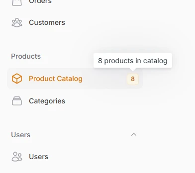
Display real-time data and status information directly within navigation items using badges with custom colors, tooltips, and dynamic content. Perfect for showing notification counts, pending approvals, or any metric that requires immediate attention.
<?php

namespace App\Filament\Resources\Products;

use App\Models\Product;
use Filament\Resources\Resource;

class ProductResource extends Resource
{
    // Show total product count
    public static function getNavigationBadge(): ?string
    {
        return static::getModel()::count() ?: null;
    }

    // Color based on stock levels
    public static function getNavigationBadgeColor(): ?string
    {
        $lowStockCount = static::getModel()::where('stock_quantity', '<=', 10)->count();
        $totalProducts = static::getModel()::count();

        return match (true) {
            $lowStockCount > ($totalProducts * 0.2) => 'danger', // 20%+ low stock
            $lowStockCount > 0 => 'warning', // Some low stock
            $totalProducts > 100 => 'success', // Healthy inventory
            default => 'primary',
        };
    }

    // Detailed tooltip
    public static function getNavigationBadgeTooltip(): ?string
    {
        $total = static::getModel()::count();
        $lowStock = static::getModel()::where('stock_quantity', '<=', 10)->count();

        if ($lowStock > 0) {
            return "{$total} products total, {$lowStock} low stock alerts";
        }

        return "{$total} products in catalog";
    }
}
# Collapsible sidebar layouts
Transform your sidebar to maximize screen real estate with smart collapsible designs that preserve functionality while minimizing visual clutter. Choose between icon-only collapsed states or fully hidden sidebars based on your users' workflow needs.
// In your Panel Provider
public function panel(Panel $panel): Panel
{
    return $panel
        ->sidebarCollapsibleOnDesktop() // Shows icons when collapsed
        ->sidebarWidth('20rem') // Custom expanded width
        ->collapsedSidebarWidth('5rem'); // Custom collapsed width
}

// Or fully collapsible (completely hidden)
public function panel(Panel $panel): Panel
{
    return $panel
        ->sidebarFullyCollapsibleOnDesktop()
        ->collapsibleNavigationGroups(false); // Disable group collapsing
}
# Custom navigation items
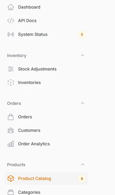
Add external links, custom pages, and specialized functionality to your navigation structure without creating full Filament resources. Perfect for integrating analytics dashboards, external tools, or custom application features.
// In your Panel Provider
use Filament\Navigation\NavigationItem;

public function panel(Panel $panel): Panel
{
    return $panel
        ->navigationItems([
            NavigationItem::make('Order Analytics')
                ->url('https://analytics.filament-hub.com', shouldOpenInNewTab: true)
                ->icon('heroicon-o-chart-bar')
                ->group('Orders')
                ->sort(10),
            NavigationItem::make('API Docs')
                ->url(route('api.docs'))
                ->icon('heroicon-o-code-bracket'),
            NavigationItem::make('System Status')
                ->url('/admin/status')
                ->icon('heroicon-o-signal')
                ->badge(fn () => Cache::get('system_alerts_count')),
        ]);
}
# Top Navigation
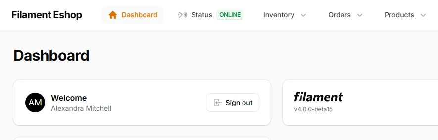
Filament's top navigation transforms the traditional horizontal navigation paradigm into a sophisticated, space-efficient interface that maximizes screen real estate while maintaining excellent usability.
use Filament\Panel;

public function panel(Panel $panel): Panel
{
    return $panel
        // ...
        ->topNavigation();
}