
Boolean Fields
Whether you need simple on/off switches, traditional checkboxes, or sophisticated conditional form logic, Filament's boolean field components provide the flexibility and user experience modern applications demand. From elegant toggle switches with custom icons to dynamic field visibility based on boolean states, these components transform basic true/false inputs into intuitive, accessible interface elements that enhance user interaction and streamline data collection workflows.
# Toggle Switches
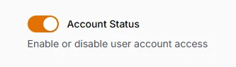
The modern alternative to checkboxes, toggle switches provide immediate visual feedback with smooth animations and clear on/off states. Perfect for settings panels, feature toggles, and any interface where users need to understand the current state at a glance. Eloquent integration ensures proper boolean casting for database persistence.
use Filament\Forms\Components\Toggle;

Toggle::make('is_active')
    ->default(true)
    ->label('Account Status')
    ->helperText('Enable or disable user account access')
# Traditional Checkboxes
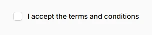
Classic checkbox inputs that provide familiar user interaction patterns while maintaining Filament's consistent styling. Essential for terms acceptance, multi-option selections, and scenarios where traditional form patterns are preferred. Support both inline and stacked layouts to match your form's visual hierarchy.
use Filament\Forms\Components\Checkbox;

Checkbox::make('terms_accepted')
    ->label('I accept the terms and conditions')
    ->accepted() // Validation rule
    ->inline(),
# Boolean Radio Groups
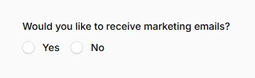
Yes/No radio button pairs that provide explicit choice presentation for important decisions. Ideal for surveys, feedback forms, and situations where the boolean choice needs to be deliberately explicit rather than a simple toggle. Creates clear visual separation between positive and negative responses.
use Filament\Forms\Components\Radio;

Radio::make('wants_marketing_emails')
    ->label('Would you like to receive marketing emails?')
    ->boolean()
    ->inline(),
# Toggle Button Groups
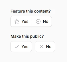
Stylized button-based boolean selection that transforms simple yes/no choices into engaging, interactive elements. These visual toggle buttons provide better user experience for mobile interfaces and add sophisticated styling to important boolean decisions with customizable colors and icons.
use Filament\Forms\Components\ToggleButtons;

ToggleButtons::make('featured_content')
    ->label('Feature this content?')
    ->boolean()
    ->grouped()
    ->icons([
        true => 'heroicon-o-star',
        false => 'heroicon-o-minus-circle',
    ]),

ToggleButtons::make('public_visibility')
    ->label('Make this public?')
    ->boolean()
    ->inline()
    ->colors([
        true => 'success',
        false => 'danger',
    ]),
# Icon-Enhanced Toggles
Visual storytelling through icons that communicate the boolean state's meaning instantly. Custom on/off icons transform abstract true/false values into intuitive visual cues, perfect for admin panels where quick recognition of settings states improves workflow efficiency and reduces cognitive load.
use Filament\Forms\Components\Toggle;

Toggle::make('is_admin')
    ->label('Administrator Access')
    ->onIcon('heroicon-m-shield-check')
    ->offIcon('heroicon-m-user'),